

TLDR
Duration: 2 Months
Role: End-to-End
Process:
User Research
Analytics
Feature Set
Wireframes
Design System & Branding
Hi-fidelity Mockups
Usability Testing & Iterations
Handoff
What’s the problem?
Inflation, and privatization have made it increasingly hard to afford groceries. Individualism, and capitalism encourages isolation from others. The result is utilitarian eating that replaces joy and community with efficiency and survival.
Why was it necessary to solve the problem?
I believe governments will continue to shift priorities from serving the people to serving themselves. I hope I’m wrong, and have simply made a fun app where you can cook with new people. If I’m right, this is a way to begin to prioritize community care, realize common goals, and learn to take action together.
How was the problem approached?
By collecting and analyzing data from users to identify patterns, themes, and actionable insights that inform design decisions and strategies.
What’s the solution?
Split up the tasks involved in hosting a dinner party-buying and getting ingredients, having a space to cook and eat, cooking, and cleanup-into separate roles, making it a team effort in which all are rewarded by good food and good company.
What was the final deliverable?

An MVP product, with a defined brand that is
backed by proof of user research, analytics, and tests.
RESEARCH
Working in the restaurant industry I have seen how access to food, leisure, and companionship, is a privilege that only some get to experience daily, or at all, for that matter. This is what got me thinking about food as communion.
I began researching meal planning, shared kitchens, free fridges, how communities fed people in the past, and how that’s changed.
I looked into other organizations and tools that strive to make cooking easier in one way or another. Hungy Root, for example, is a meal prep delivery service. Meals On Wheels is a non-profit that assists elderly who are struggling with meals and general good and safe living.
Both, for different reasons, are limiting and exclusive solutions.
Then, I interviewed people about their eating habits, sense of community, and hardships of living in a modern age and where and why all these topics do and don’t collide.


All interviewees validated that community it’s important, and that sharing a meal with others is a great way to bond.
Interviewees also said they do not experience community on a daily or even weekly basis. This was due to either lack of time, lack of resources, lack of community, lack of space or a combination of these.

Design
What actions will users at minimum need to be able to do within the product?
Based on research that led to mock personas and user flows, the average user needs to:
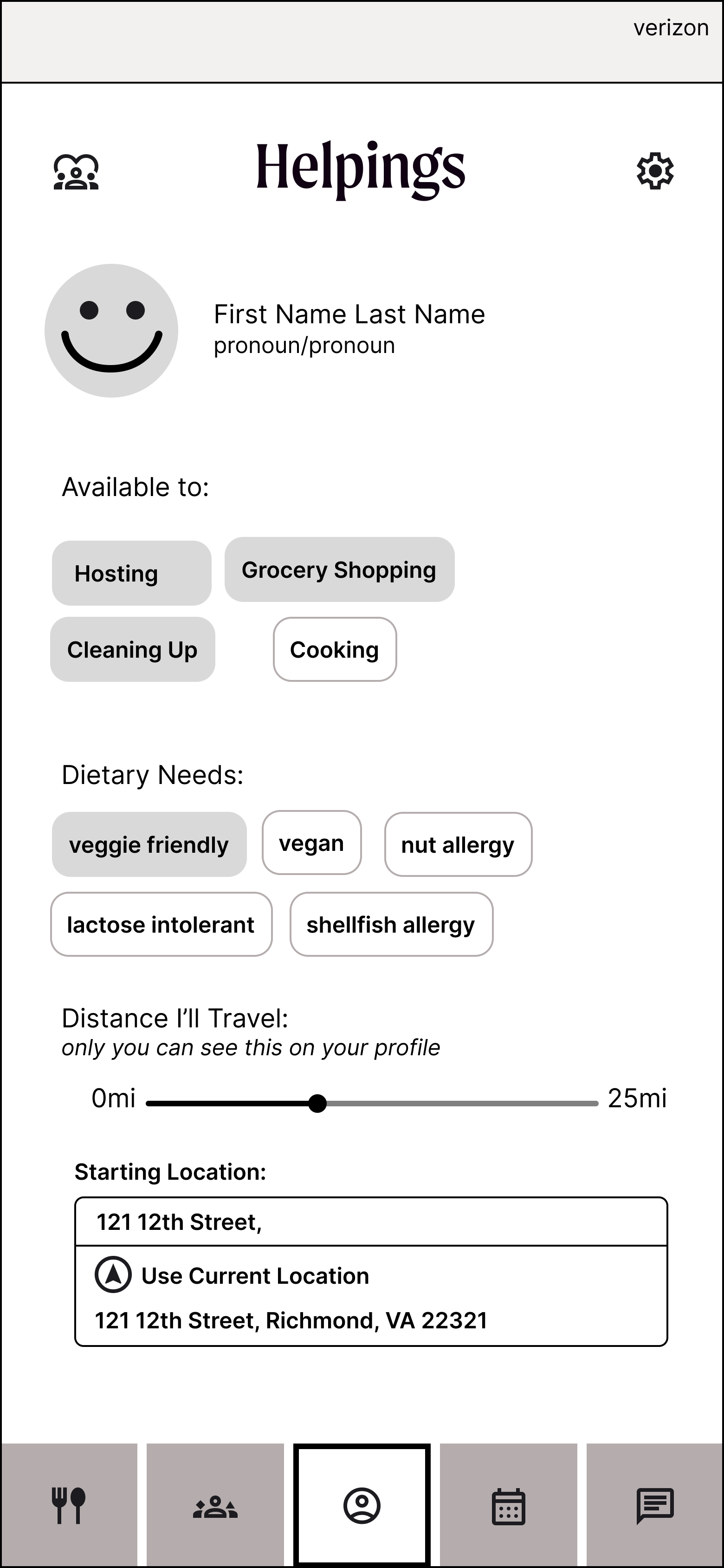
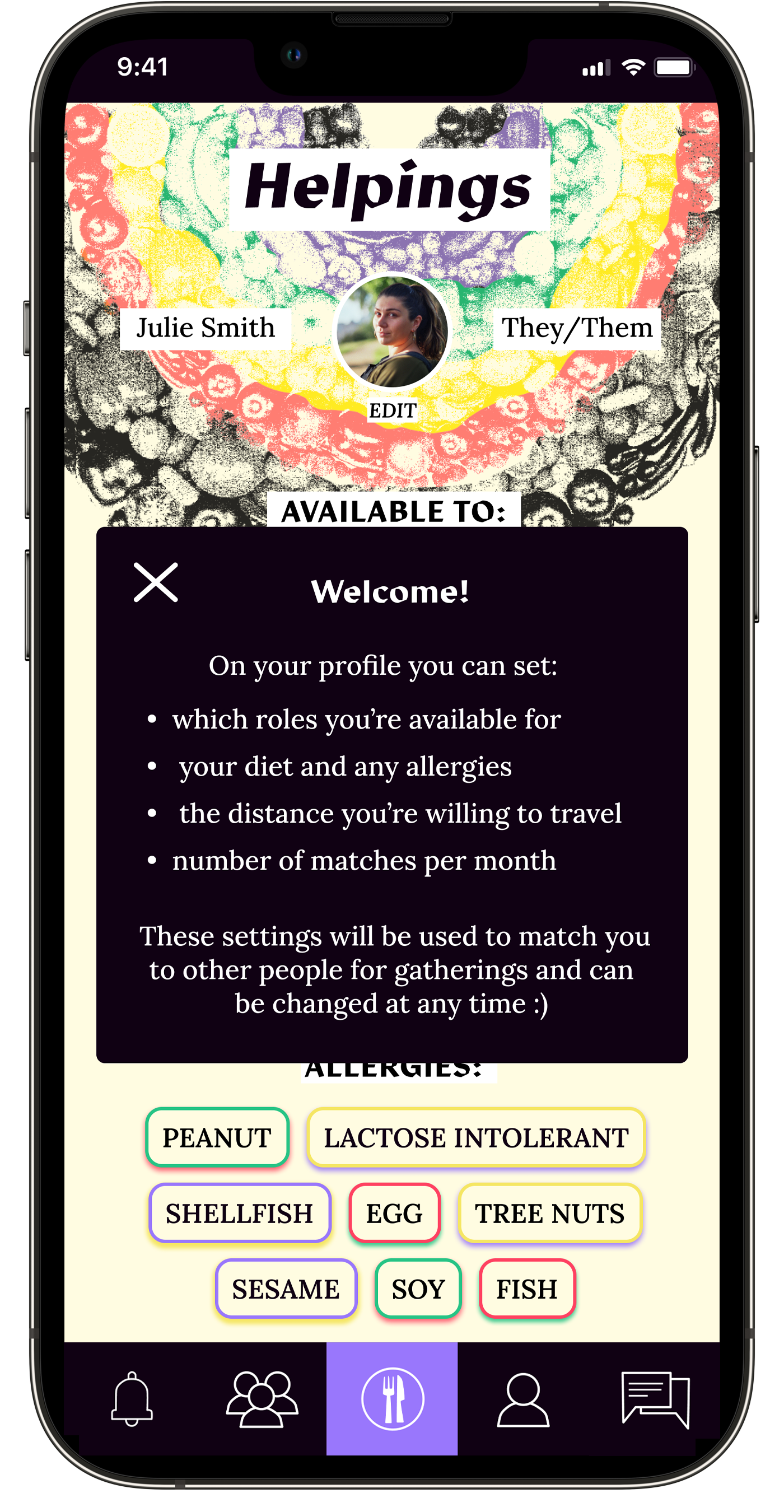
Specify what they’re able to contribute, their dietary needs, budget, and any travel limitations.
View meals that align with diet and budget settings set
in profile.Get connected to others and assigned a role within a gathering that is based on profile and meal specifications
Message others within and outside of gatherings
Agree on a day and time to meet within a matched gathering
Be able to leave and join gatherings
The priority was to connect users to one another, and facilitate gatherings between users, where everyone’s responsibilities are understood beforehand.
Below are my low-fi wireframes.
-
![]()
Set up profile
-
![]()
See meals of months based on settings in profile
-
![]()
Get matched to gather with others based on meal and profile settings
-
![]()
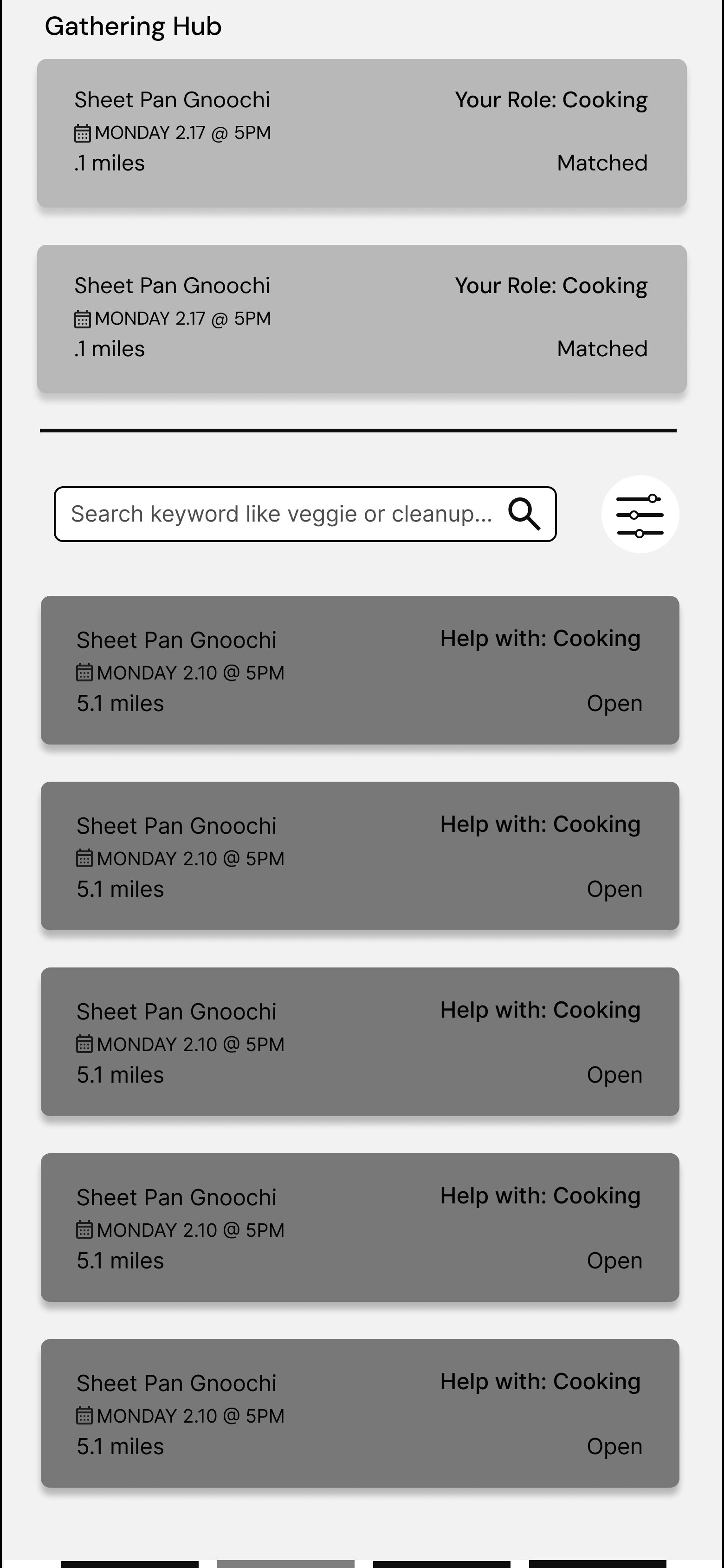
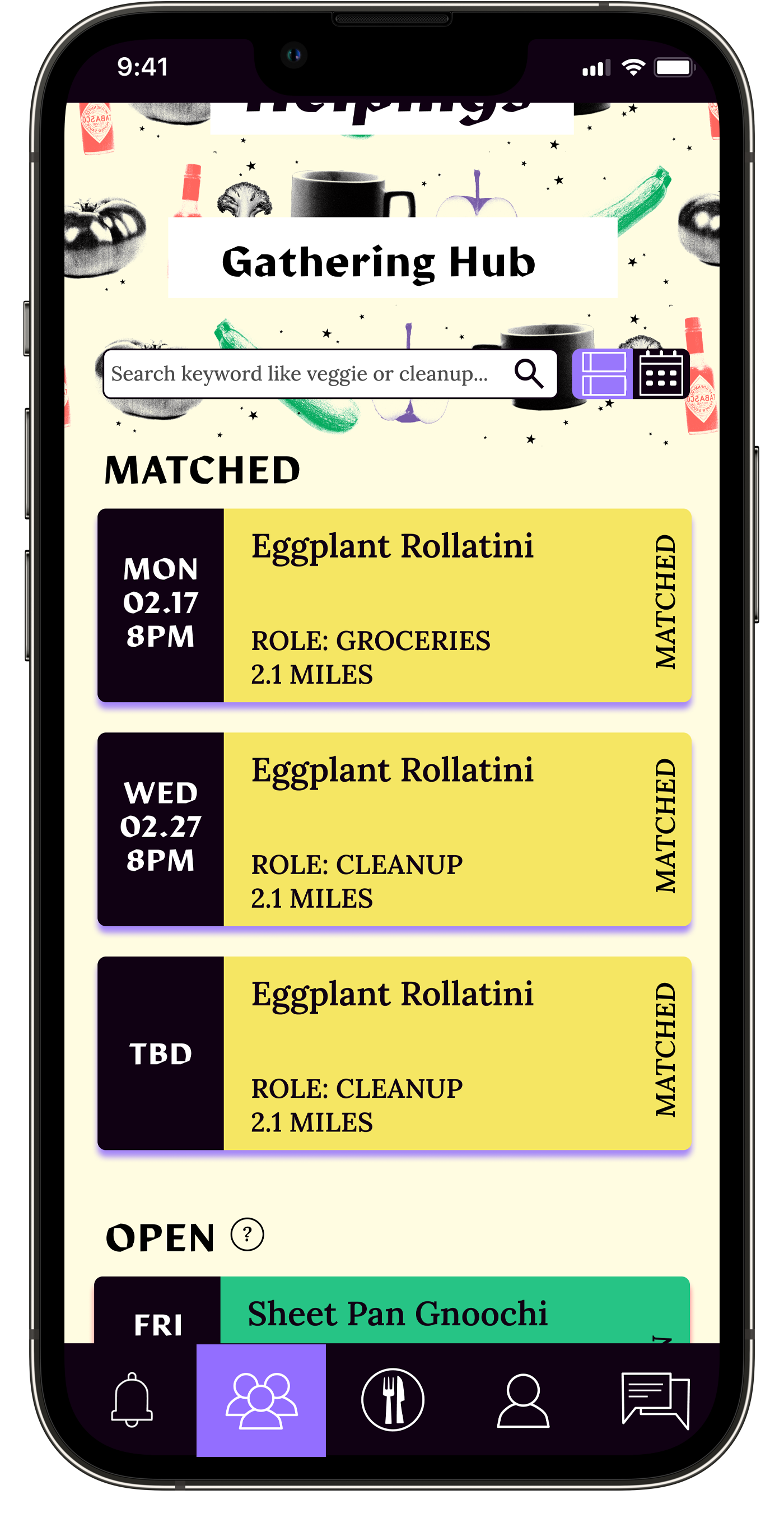
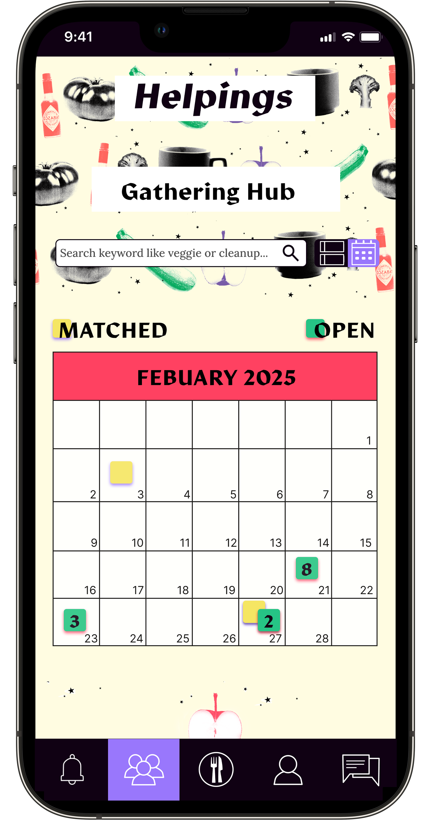
Calendar view of matched and open gatherings
-
![]()
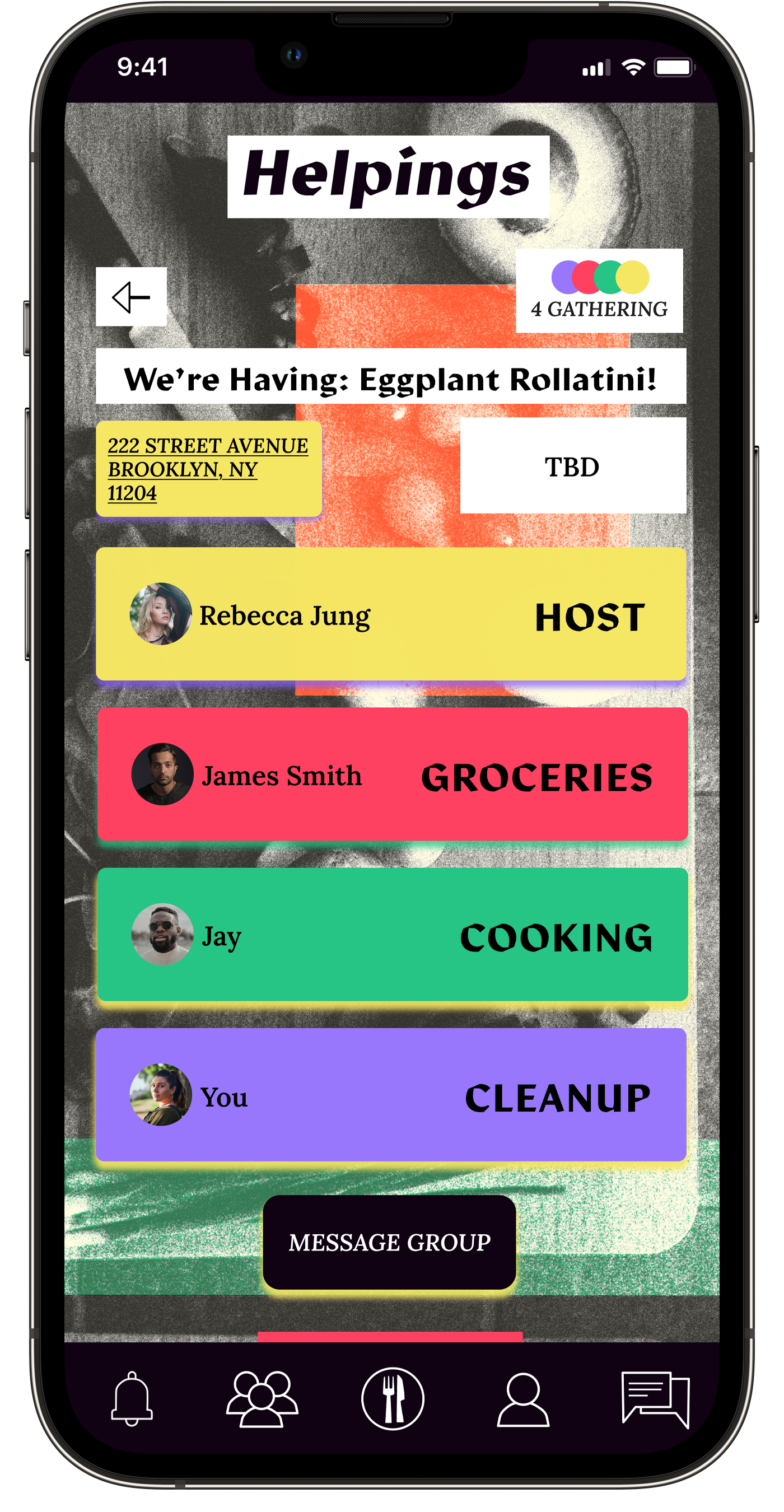
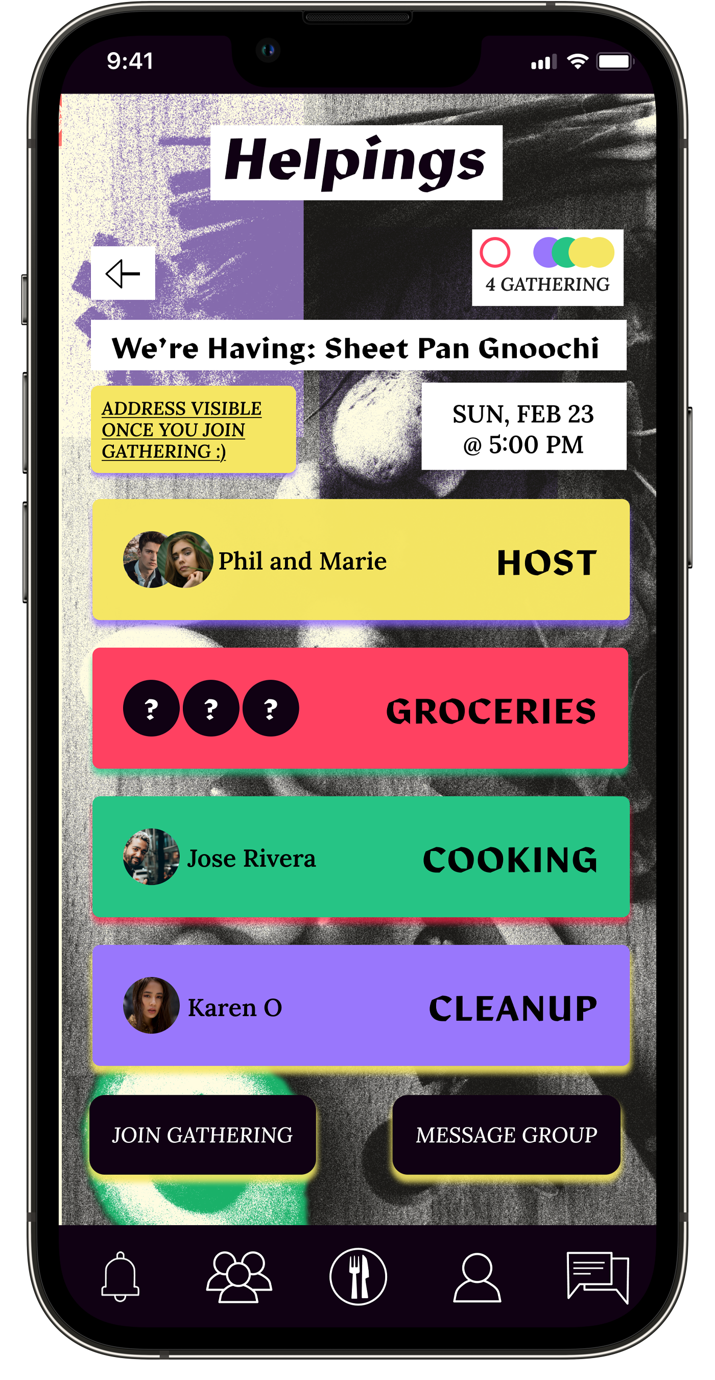
Matched Gathering with set responsibilities for each attendee
-
![]()
See more information within each role
-
![]()
Message everyone within a gathering


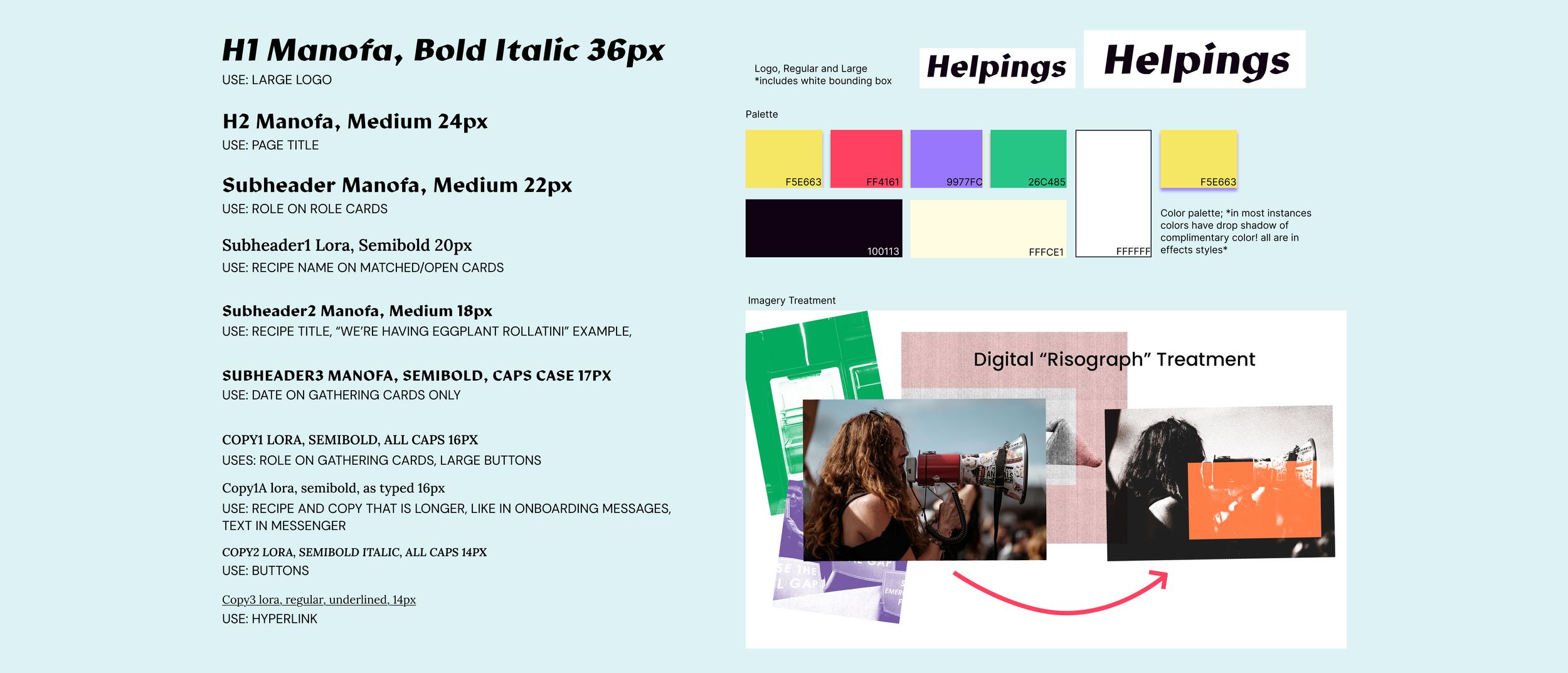
Branding
Was branding important?
In short, YES.
From the perspective of socialism and mutual benefit, building community is the greatest form of resistance and revolution. Gathering up with strangers to cook and eat a meal together-is certainly a bold suggestion. That’s on purpose.
I needed this product to stand out, to say “we are thinking differently” even thinking differently aesthetically. I wanted to use colors that you would see at a fiesta, or at a large farmers market, and imagery that referenced protests posters and independent newspapers.

Mid-Fi Feedback
Testing and Iteration
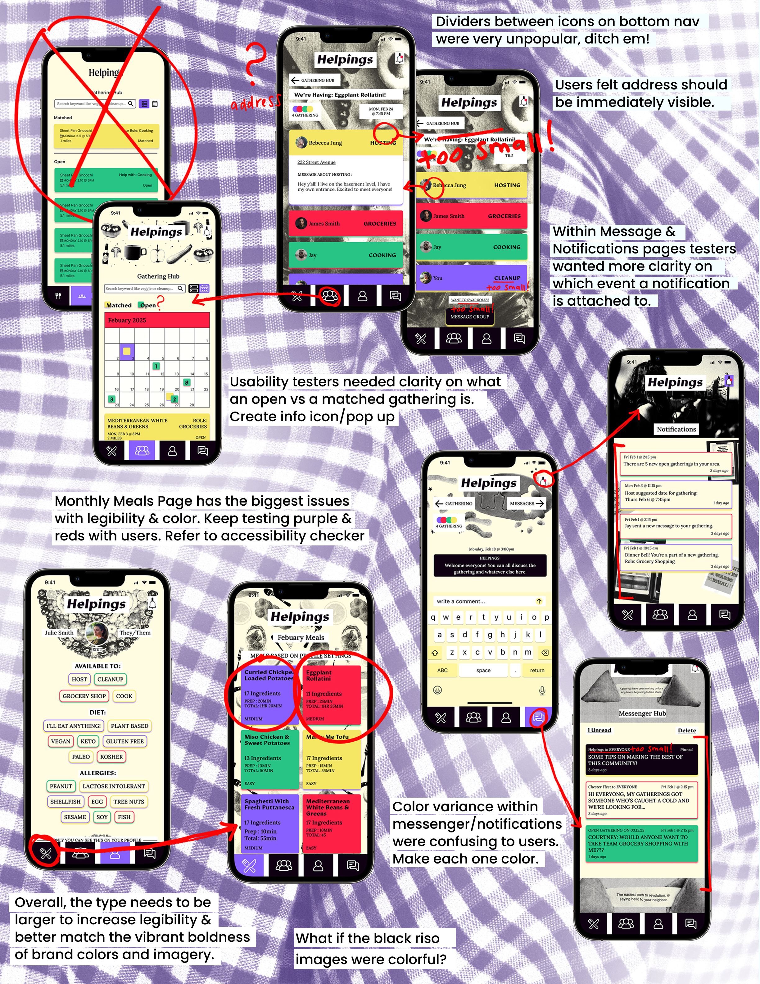
What’s sort of tasks were tested?
Set up profile settings
General Navigation; check for sitemap clarity
-Check for color legibility
-Check for brand continuityLook at Matched Gatherings and Open Gatherings in Hub
-Check for understanding of matched and openGo to matched event and respond to Host’s
suggested date.Swap tasks with someone in matched gathering
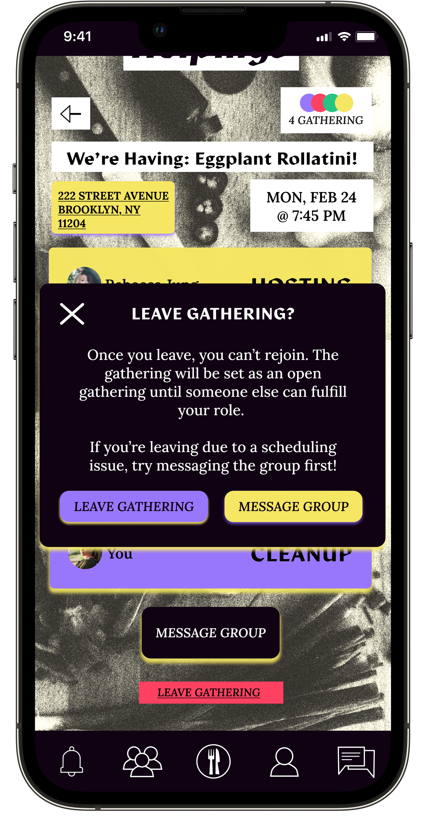
Leave matched gathering
What’s the overall impression?
With low & mid testing users expressed and interest in the visual design and in the premise itself however there was still a need for clarity on certain terms and some room for improvement on information hierarchy.
What needs more work?
Open Gatherings:
create flows for joining an open gathering at test.
Add an info pop-up next to the Open Gatherings that explains the difference between open and matched.
Color and legibility:
Continue to test accessibility and comfortability with red and purple until testing supports choice.
Monthly Meals and Recipes:
Create icons for dietary issues on meal cards and note price per person within the recipe.

My favorite part of this process was when I looked at my work and asked,
“why is this bad?”
Then I list out all the reasons it is bad.
I love this part because if I can figure out the flaws and state them plainly, the fix is right there too. That’s really exciting, and my work tends to change quicker, and look better immediately.
-
![]()
-
![]()
-
![]()
Onboarding message
-
![]()
Budget onboarding info
-
![]()
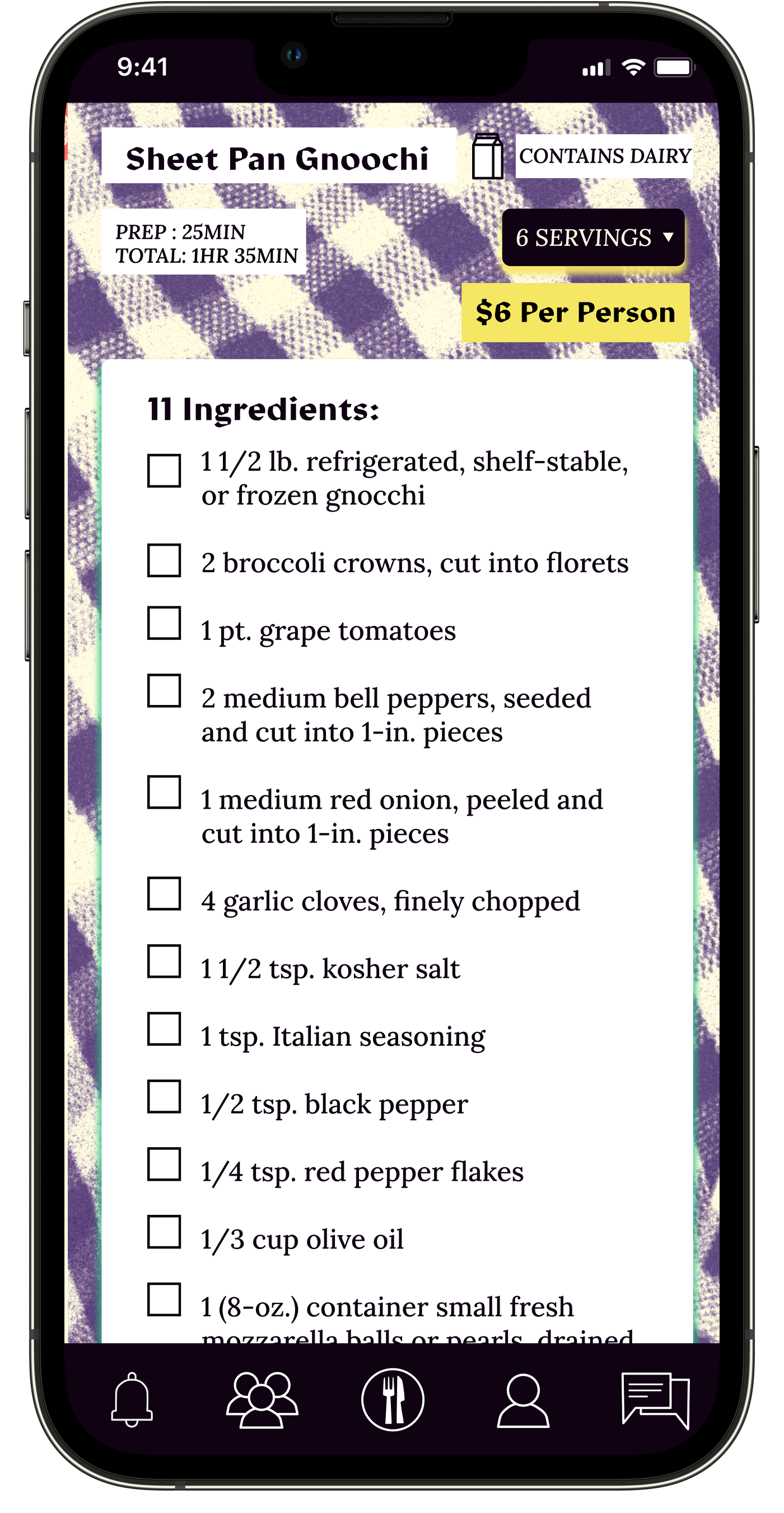
Recipes with icons notifying allergies and dietary restrictions. Meals shown based on settings in profile.
-
![]()
Gingham background of recipe corresponds with Title Card on recipe list page.
-
![]()
-
![]()
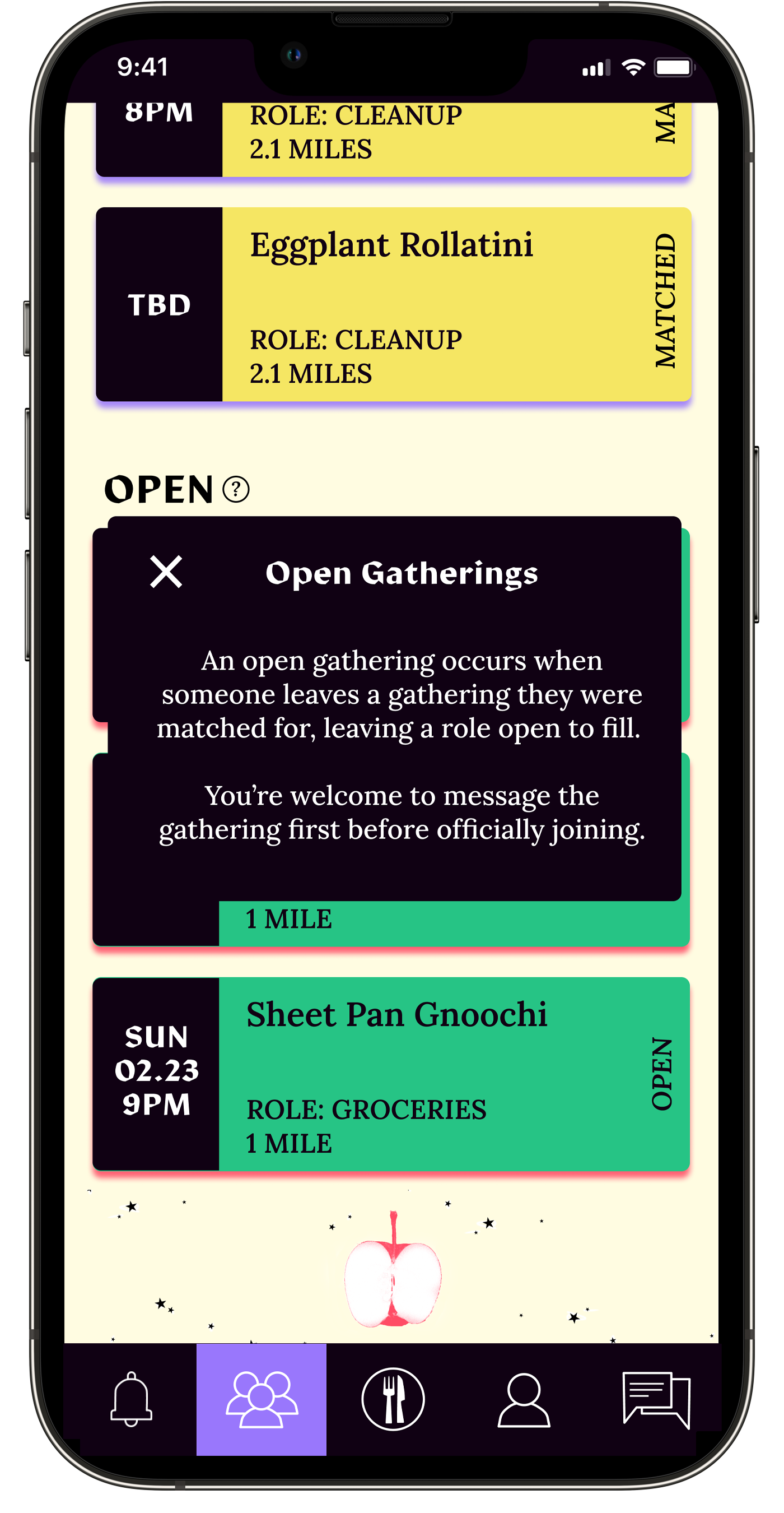
Gathering Hub; List View
-
![]()
Gathering Hub; Calendar View
-
![]()
Date and time TBD until all agree on a time suggested by Host
-
![]()
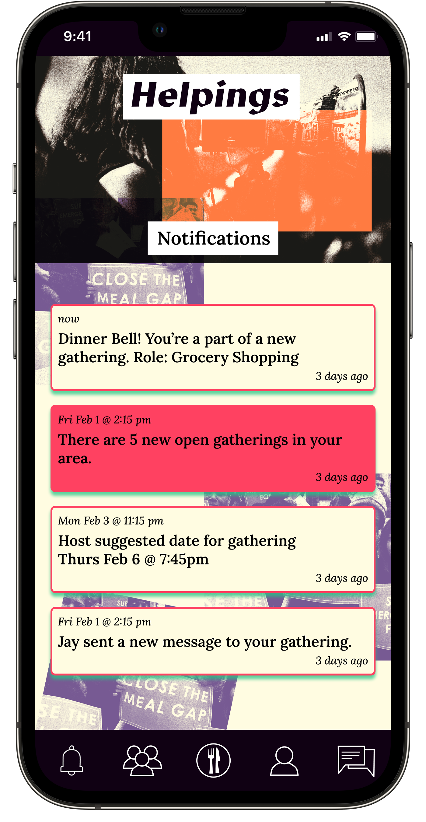
Pop up notification when Host Suggests Time and Date
-
![]()
-
![]()
Matched gatherings appear on Calendar when date is set.
-
![]()
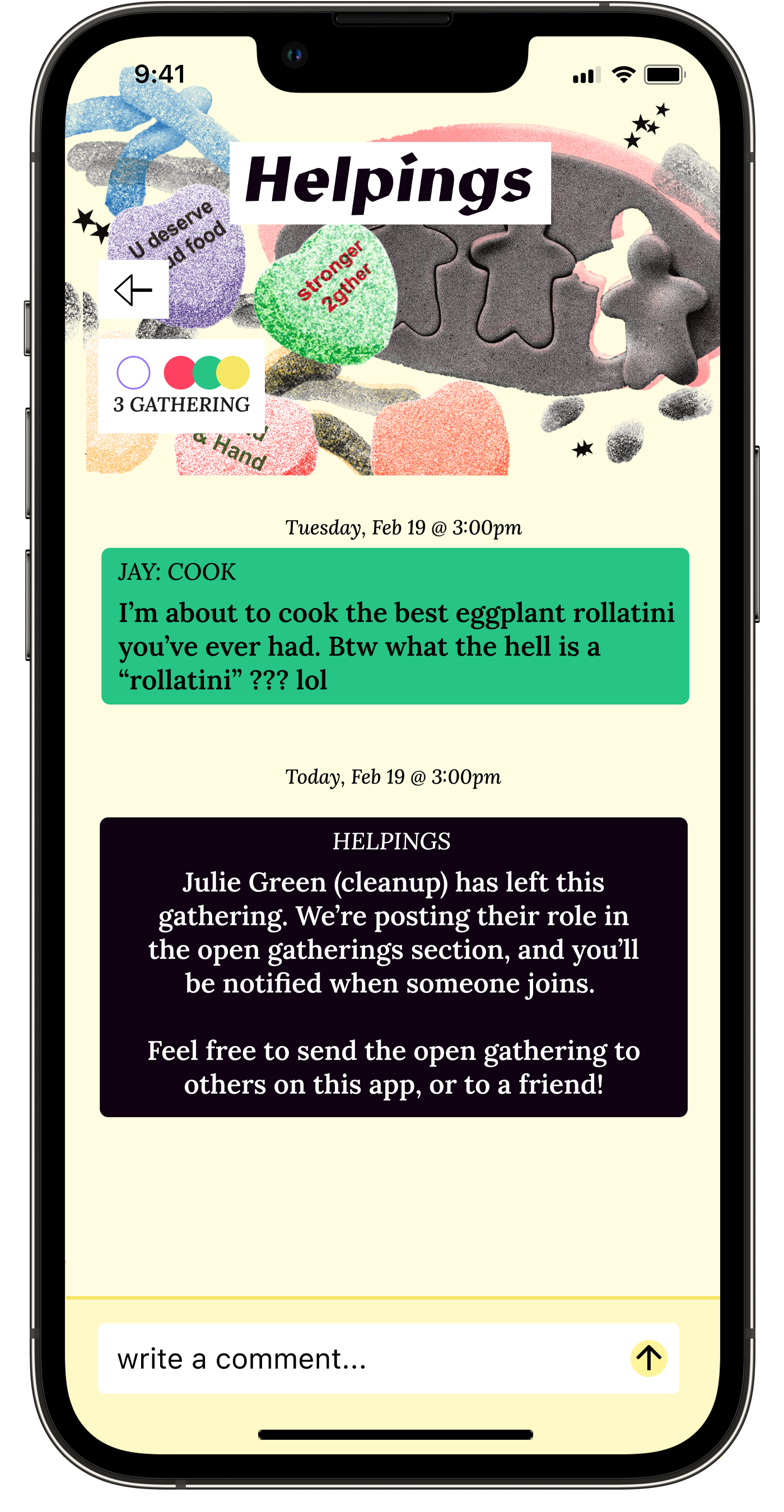
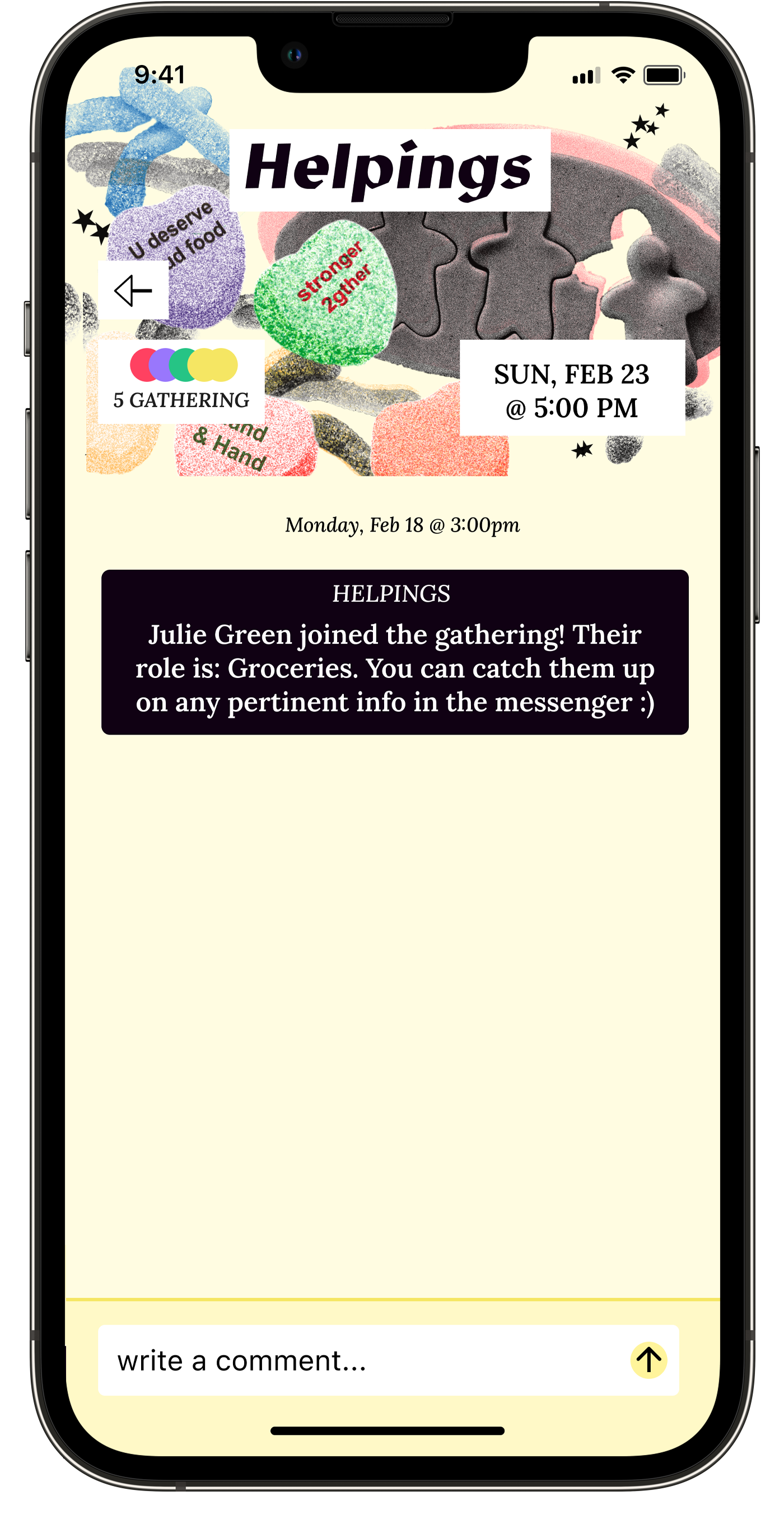
All notifications for gathering sent within messenger so everyone can always discuss as a group.
-
![]()
-
![]()
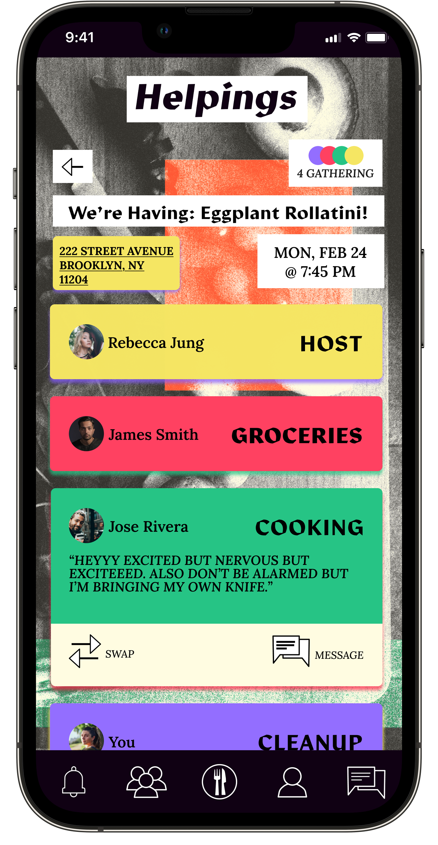
Click on any Role Card to see they're "say hi" message, swap roles, or directly message.
-
![]()
-
![]()
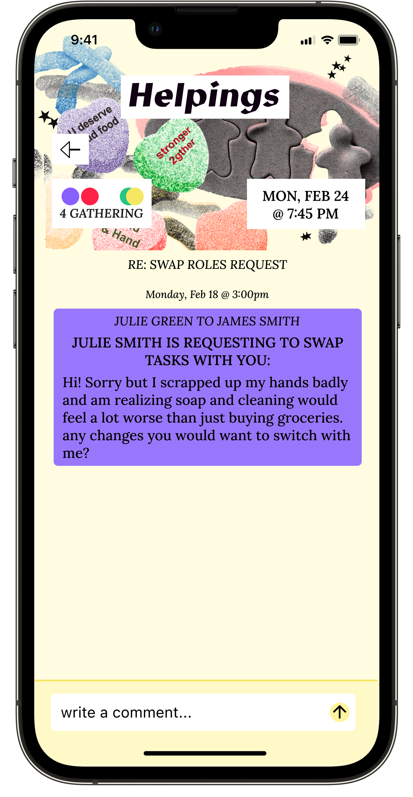
Dropdown to pick role to request a swap with.
-
![]()
Any message prompt by app and not another user will always be black.
-
![]()
Message is still connected to gathering but only visible between two users. If request is approved, all will be alerted.
-
![]()
-
![]()
-
![]()
Head Count in upper left changes when people come and go.
-
![]()
-
![]()
-
![]()
Info on "Open Gatherings" available when user clicks Question icon.
-
![]()
Date for Open Gathering is set as all users have already agreed upon date.
-
![]()
Role that's open is clearly specified.
-
![]()
User can always see the recipe of the dish being made at any gathering, whether they're part of gather or checking out an open gathering.
-
![]()
New List Item
-
![]()
User appears once they've taken open role.
-
![]()
New List Item
-
![]()
Unread notifications are solid filled red.
-
![]()
Messages separated into folders to keep things uncluttered.


Prototyping
What’s Next?
Thoughts?
If you have any questions, comments, or general interest in this project or ideas about mutual aid, let’s talk!
Helpings is not yet a reality, but it will continue to take form. Next Steps include:
Collaborate with developers to design a secure, fair payment system for grocery contributions
Build conflict resolution flows for real-world scenarios (damaged items, last-minute cancellations, dietary miscommunications)
Continue refining the information architecture based on user feedback about terminology and hierarchy